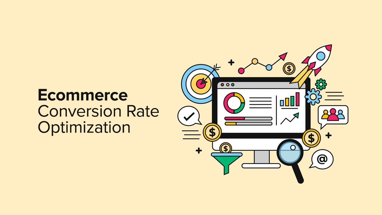
5 Conversion Fixes That Doubled Sales
Most ecommerce brands facing slow sales make the same knee-jerk decision: spend more on ads. More traffic, more sales — that is the assumption. But if your store is converting at 1.5% and you double your traffic, you still have a store converting at 1.5%. You have just paid twice as much to prove it.
The real problem is almost never traffic. It is what happens to traffic once it arrives. At Vertex, the first thing I do when a brand says sales are slow is not look at the ad account. I audit the store. Because in every single case I have worked on, the biggest gains were not in the marketing — they were hidden inside the website itself, waiting to be unlocked.
These are the five conversion fixes I have applied consistently across ecommerce brands — fixes that require no additional ad spend, no new products, and no complete redesign. Just sharp, focused changes to what is already there.
average ecommerce conversion rate — most stores are losing 97% of visitors
drop in conversions for every single second of extra page load time
of abandoned carts recovered on average with a 3-email flow
You do not have a traffic problem. You have a conversion problem. Fix the store before you fund the ads.
— Husnain Mustafa, Founder & MD, Vertex
1 Simplify and Strip Back the Product Page
The most common mistake I see on ecommerce product pages is too much. Too many images fighting for attention. Too much copy that explains features no one asked about. Too many upsell widgets, pop-ups, and add-ons cluttering the page before the customer has even decided they want the product.
The counterintuitive truth about conversion is this: removing content often increases sales more than adding it. When a customer lands on a product page, they need to answer one question quickly — is this right for me? Every extra element on the page that does not help answer that question is working against you.
A clean, focused product page removes friction between intent and purchase — the core principle of high-converting UX.
The structure that converts best is simple: one dominant product image above the fold, a clear and outcome-focused headline, two to three sentences of benefit-led copy, and a single prominent call-to-action button. Everything else — specifications, FAQs, extended reviews — belongs below the fold, accessible but not intrusive. Lead with the decision. Support it below.
Quick Fix
Audit your product page on mobile first. If your add-to-cart button is not visible without scrolling on a phone screen, you are losing a significant portion of your buyers before they ever reach it. Fix this before anything else.
2 Rewrite Your Call-to-Action Button
The words on your buy button are doing more work than most brands realise. “Add to Cart” is the default — it is also the weakest possible option. It is transactional, passive, and says nothing about why someone should act right now. In a market where attention lasts seconds and choices are endless, passive language is conversion poison.
The best-performing CTA buttons speak to outcome, ownership, or urgency — and ideally all three. Consider what changes when you move from “Add to Cart” to language like “Get Mine Now,” “Claim Your Bundle,” “Start Today,” or “Yes, I Want This.” The emotional register shifts entirely. You are no longer describing a mechanical action — you are confirming a decision the customer has already made emotionally.
- ✗Weak: Add to Cart — transactional, says nothing about value or urgency
- ✓Stronger: Get Mine Now — creates ownership and immediacy
- ✓Stronger: Claim Your Bundle — implies value and exclusivity
- ✓Stronger: Yes, I Want This — mirrors the customer’s internal decision-making
- ✓Stronger: Start Saving Today — benefit-forward with a time dimension
Test two variants at a time — do not change everything at once or you will not know what moved the needle. Even a modest improvement in CTA click-through rate compounds significantly when applied across your entire product catalogue and traffic volume.
3 Move Social Proof Where It Actually Gets Seen
Social proof placed at the point of decision — not buried at the bottom — is one of the highest-impact conversion changes you can make.
Reviews placed at the bottom of a product page are largely invisible. By the time a customer scrolls that far, they have either already decided to buy — or they have already left. The placement of social proof matters as much as the proof itself, and most stores get this completely wrong.
In ecommerce, the highest-converting placement of social proof is directly adjacent to the purchase decision — not at the footer, not in a separate tab, not in a widget that requires clicking to expand. Here is the exact placement framework I use when optimising a store:
- 1Star rating with review count displayed immediately under the product title — always visible, always above the fold
- 2One or two high-impact customer quotes positioned between the product description and the CTA button
- 3Real customer photos in the review section — authentic user-generated content outperforms studio photography for trust
- 4A trust bar near the CTA — free returns, secure checkout, satisfaction guarantee — reducing perceived risk at the moment of decision
A product with 47 reviews and strong placement will consistently outconvert a product with 200 reviews buried below the fold. Placement is strategy.
4 Speed Up Your Store — Especially on Mobile
Over 70% of ecommerce traffic now comes from mobile — and slow mobile load times are silently killing conversion rates.
Page speed is a conversion factor that almost every brand underestimates — until they see the data. A one-second delay in page load time reduces conversions by an average of 7%. A three-second delay loses more than half your mobile visitors before the page even fully loads. In an environment where attention is the scarcest resource, slow is the same as invisible.
The most impactful speed fixes are not technical wizardry — they are disciplined housekeeping that most stores neglect:
- →Compress all images to under 200kb without visible quality loss — uncompressed images are the single biggest cause of slow stores
- →Audit your installed apps and plugins — every unused app adds load time; remove anything that is not actively earning its place
- →Use a performance-optimised theme — many popular themes are beautiful but bloated; speed and design do not have to be in conflict
- →Test on real mobile devices, not just desktop — most founders build and test on desktop while their customers shop on phones
Free Tool
Run your store through Google PageSpeed Insights right now. It gives you a mobile and desktop score and lists exactly which issues to fix in priority order. Aim for a mobile score above 70 as a minimum baseline.
5 Build an Abandoned Cart Recovery Flow
A well-structured abandoned cart email sequence is one of the most profitable automations any ecommerce brand can set up — and it runs on autopilot.
On average, 70% of online shopping carts are abandoned. That means for every ten customers who add a product to their cart, seven leave without buying. Most brands accept this as an unavoidable reality. The brands I work with at Vertex treat it as a recoverable opportunity — because most of the time, it is.
People abandon carts for predictable reasons: they got distracted, they wanted to compare prices, they were not quite ready to commit, or a friction point stopped them at checkout. A well-structured recovery email sequence addresses all of these without requiring a discount on every send.
The Vertex Cart Recovery Framework
Three Emails That Recover 10–15% of Abandoned Carts
- Email 1 — 1 hour after abandonment: Friendly reminder. No pressure. Just “you left something behind.” Include the exact product with image. One clear CTA back to the cart.
- Email 2 — 24 hours after abandonment: Add value. Address the most common objection — usually trust or uncertainty. Include a strong customer review of the product, your returns policy, and a reason to act soon.
- Email 3 — 72 hours after abandonment: Create urgency or add incentive. Limited stock notice if genuine, a small time-limited offer if your margin supports it, or a final clear CTA. Keep it short and direct.
Set this up once and it runs automatically on every abandoned cart. The average recovery rate across brands using this framework is 10 to 15% of abandoners. On a store doing £50,000 a month in revenue, recovering even 10% of abandoned carts adds thousands in monthly income — from zero additional ad spend.
The Compound Effect of Five Fixes
Each of these five fixes delivers meaningful results on its own. But the real power is in applying all five together — because their effects compound. A faster store with a cleaner product page, stronger social proof, a more compelling CTA, and a recovery flow working in the background does not produce incremental improvement. It produces a fundamentally different business outcome.
The brands I have worked on at Vertex that have implemented all five consistently see conversion rates move from the industry average of 1 to 2% toward 4 to 6%. On the same traffic. Without increasing the ad budget by a single pound. That is not a small optimisation — that is a transformation of the economics of the entire business.
Start with whichever fix has the biggest gap in your current store. Measure the result. Then move to the next. Build the habit of treating your store as a living, optimizable asset — not a fixed backdrop for your marketing. Because in ecommerce, the store is the product. And a better store is always the best investment you can make.